
Whole House Wellness Offices
Designing a brand that supports the people who support others.
Overview
When I began working on Whole House Wellness Offices, my goal was to create a brand that felt aligned with the kind of work happening inside the space.
Whole House is a coworking environment designed specifically for therapists, counselors, and wellness professionals. As a sister brand to an existing coworking concept, it needed to feel connected—while clearly shifting toward something quieter, more grounded, and more intentional. From the beginning, I wasn’t just designing for the space—I was designing for the people using it every day.
The Challenge
This wasn’t a typical coworking brand. The professionals using this space are doing deeply personal, often emotionally heavy work with their clients, which immediately shifted how I approached the identity.
I knew the brand couldn’t rely on trend-driven visuals or high-energy design. It also couldn’t feel overly clinical or sterile. Instead, it needed to balance professionalism with warmth—creating something that felt calm and composed, while still approachable and human. At the same time, it needed to live alongside its sister brand without feeling like a duplicate, clearly signaling a different kind of experience rooted in restoration rather than activity.
Understanding the Audience
Kala provided detailed client avatars early in the process, which gave me a clear and grounded understanding of who this space was for. These were professionals building or growing private practices—often navigating the emotional weight of their work while trying to maintain a clear boundary between their personal and professional lives.
What became clear quickly was that they didn’t just need a place to work—they needed a place that supported them. The brand had to communicate a sense of peace of mind, while also creating an environment that felt private, credible, and safe for both practitioner and client.
Because many clients arrive in vulnerable states, the brand also needed to begin building trust before a single conversation ever happens.
Visual Exploration
My research into the visual identity revealed a need to balance the high-level professional expectations of practitioners with the emotional needs of their clients. I defined a brand personality that is modern, serious, and mature, while still remaining approachable and transparent in its delivery.
I began by studying the core DNA of the parent brand, Fire House Workspace, particularly its use of Ochre and Green Gray as signals of a premium professional environment. From there, the goal was to pivot that energy. Where Fire House is built for momentum, Whole House needed to be built for restoration.
This led to two distinct directions: one centered on openness and clarity, and the other on containment and emotional grounding. The first explored a lighter, more expansive visual language designed to create a sense of mental margin and immediate relief. The second introduced more depth and contrast, using warmth and enclosure to create a feeling of safety and protection.
Both directions were grounded in the same strategy, but approached the emotional experience from different angles.


Final Direction & Identity
As Kala and I reviewed the concepts together, we aligned on a direction that created a sense of lightness and clarity, while still maintaining the structure needed to build trust and credibility.
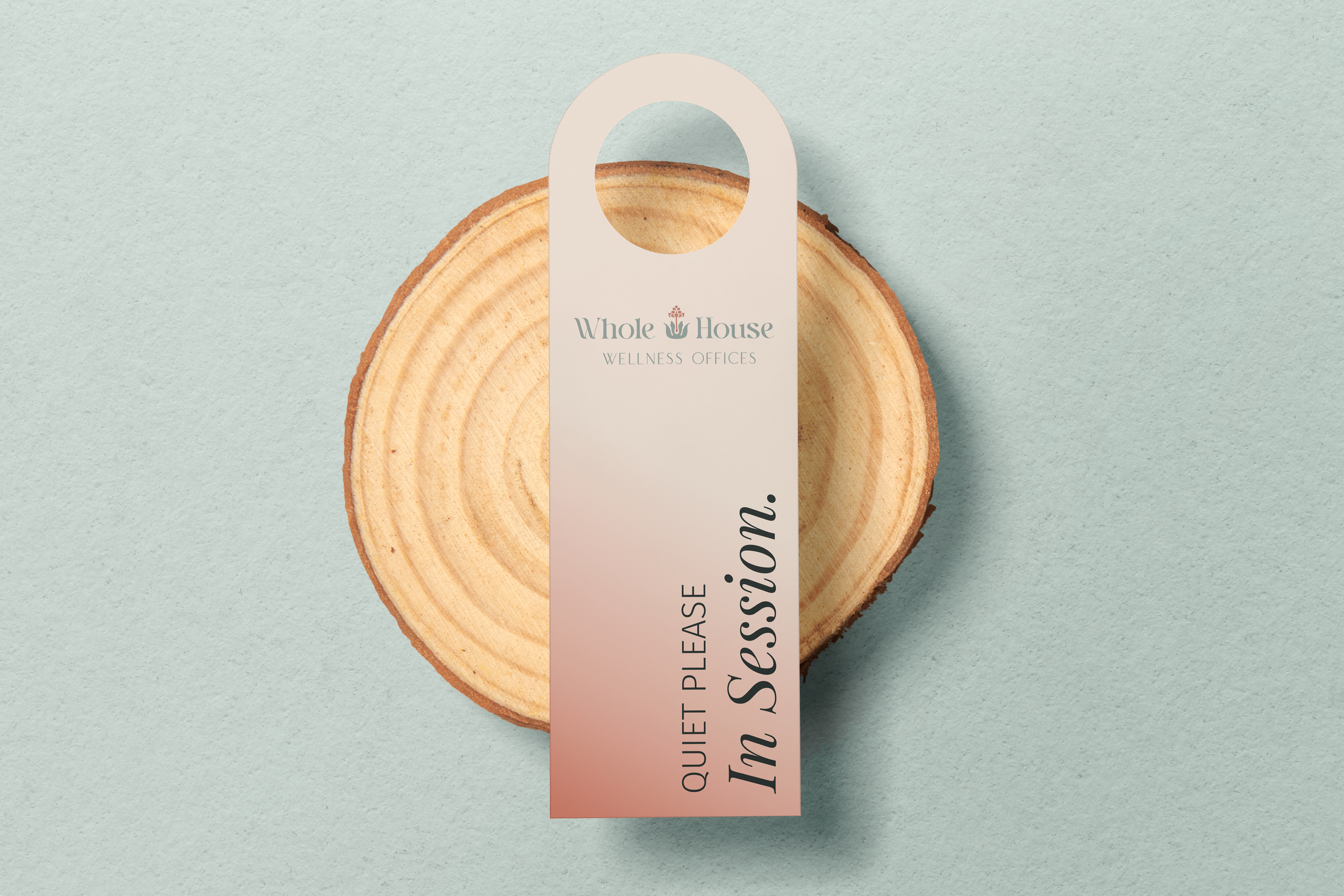
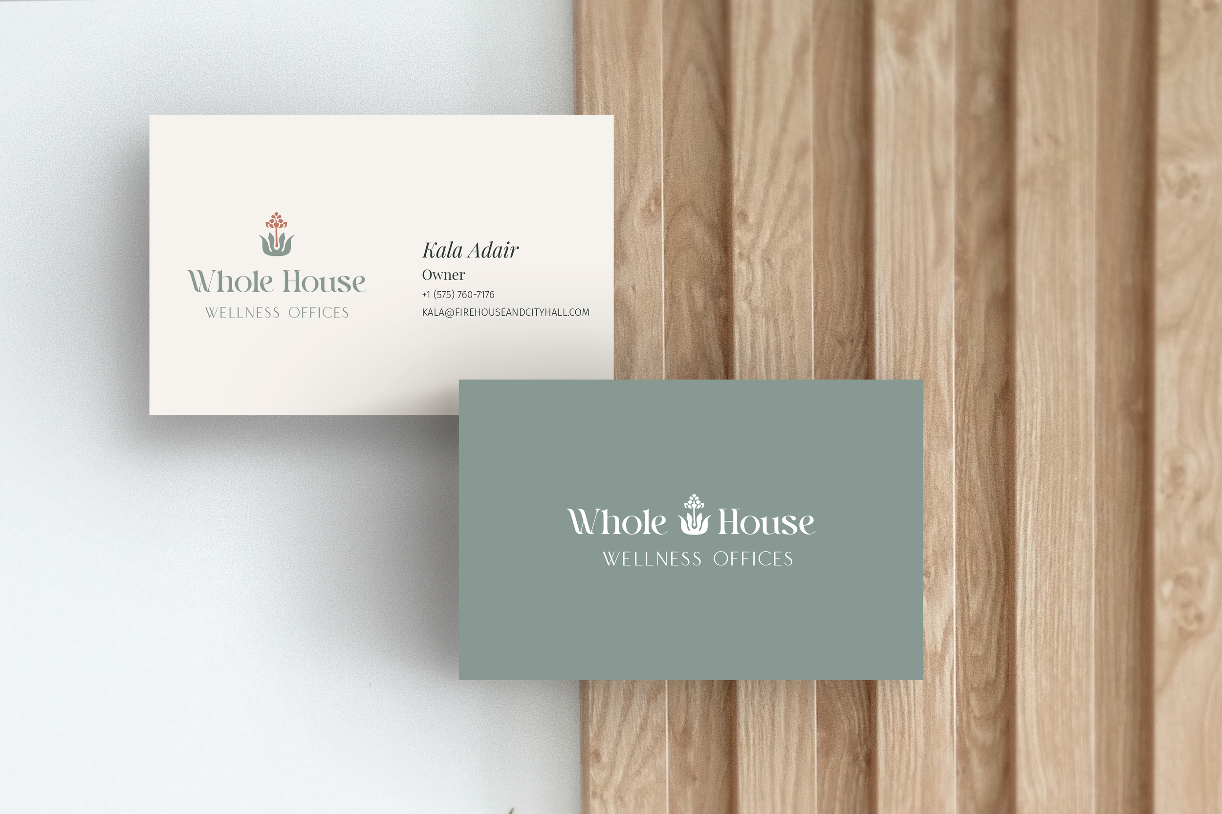
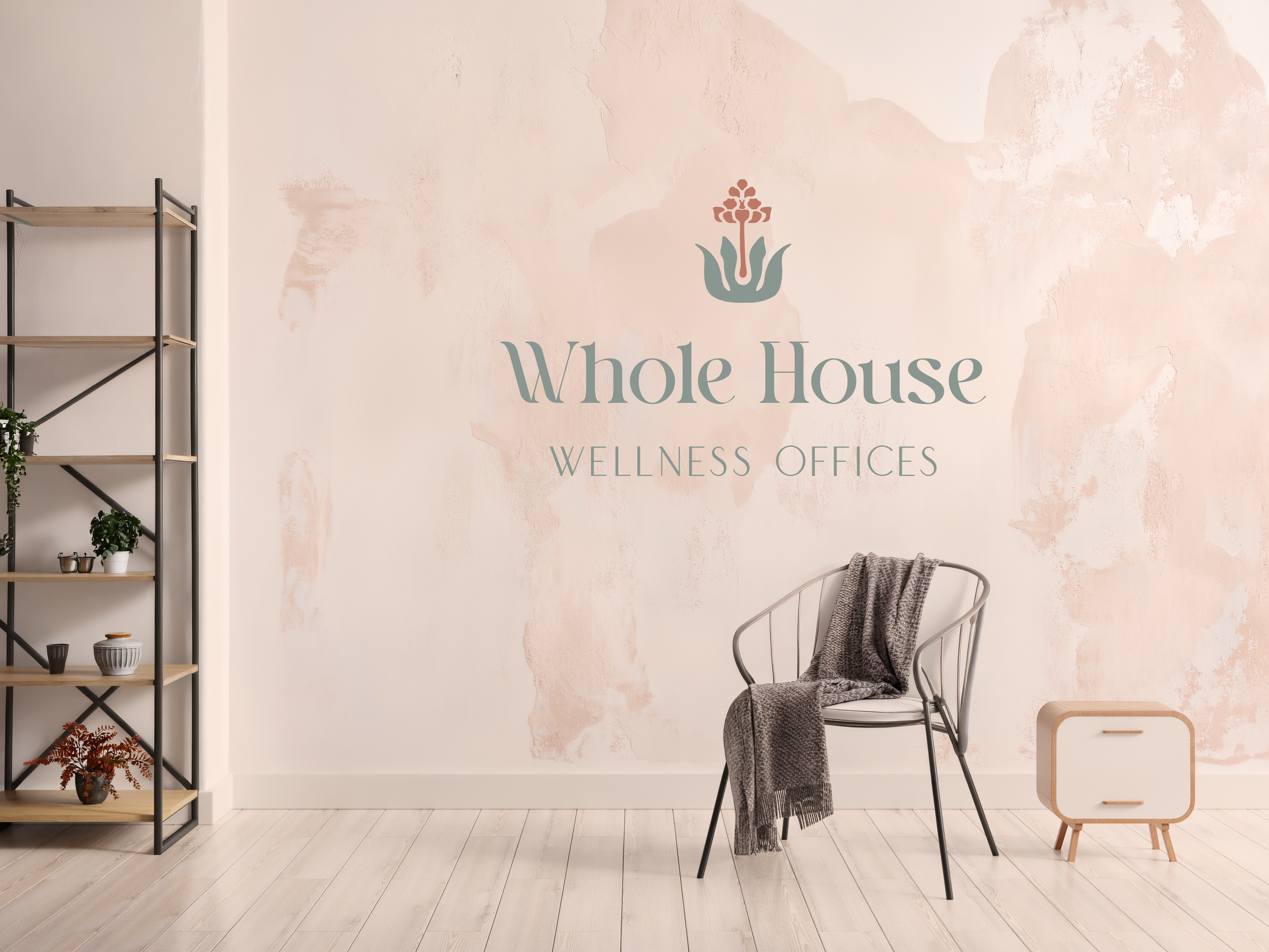
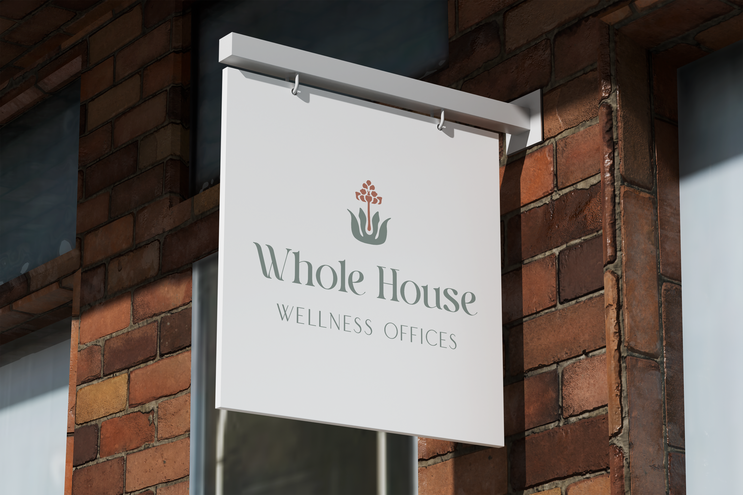
The final identity centers around a minimal botanical form inspired by the New Mexico state flower (Yucca Flower) —subtle and intentional, representing grounded growth without becoming decorative. I paired this with a humanist serif to introduce warmth and rhythm into the typography, balanced by enough structure to maintain a professional tone.
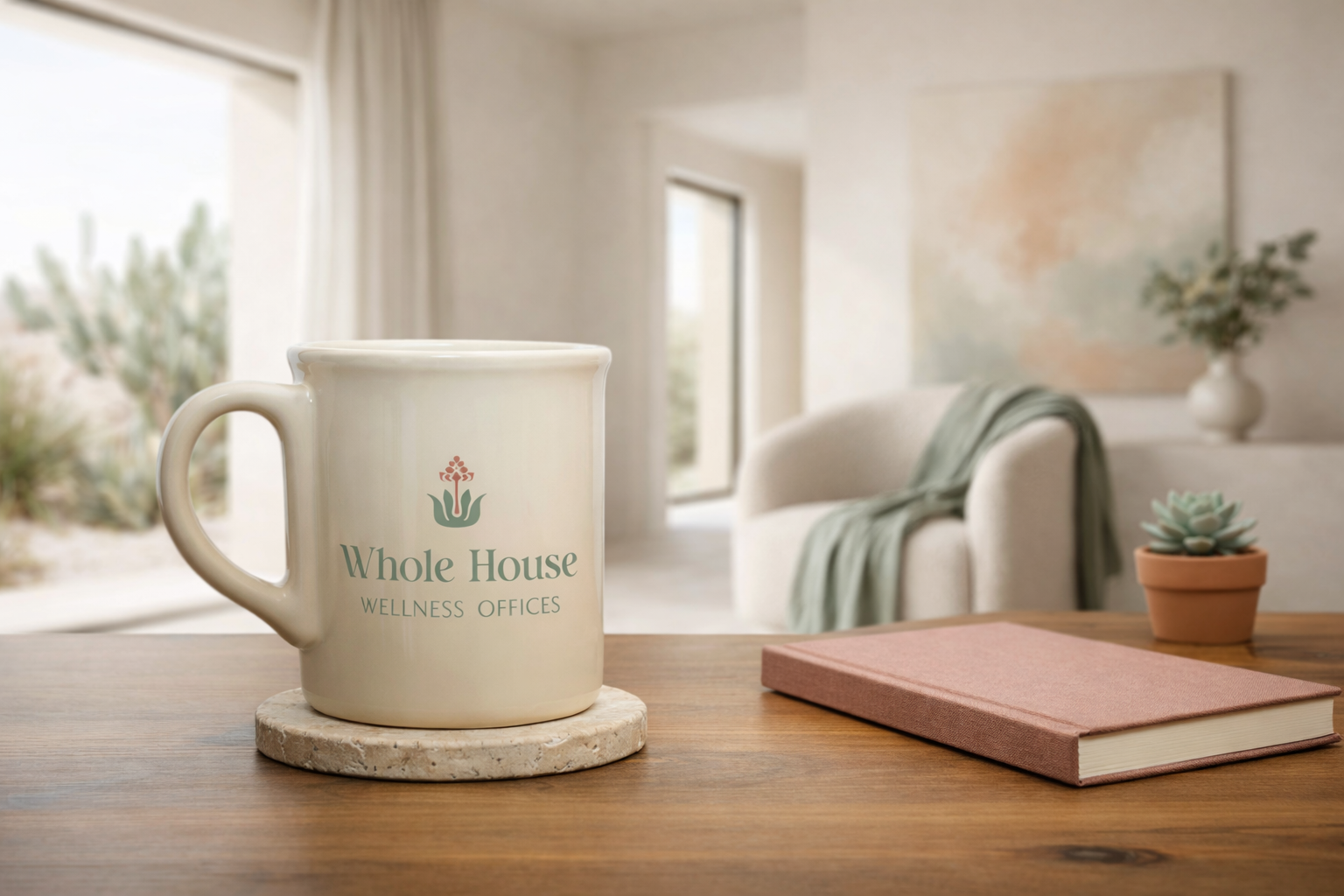
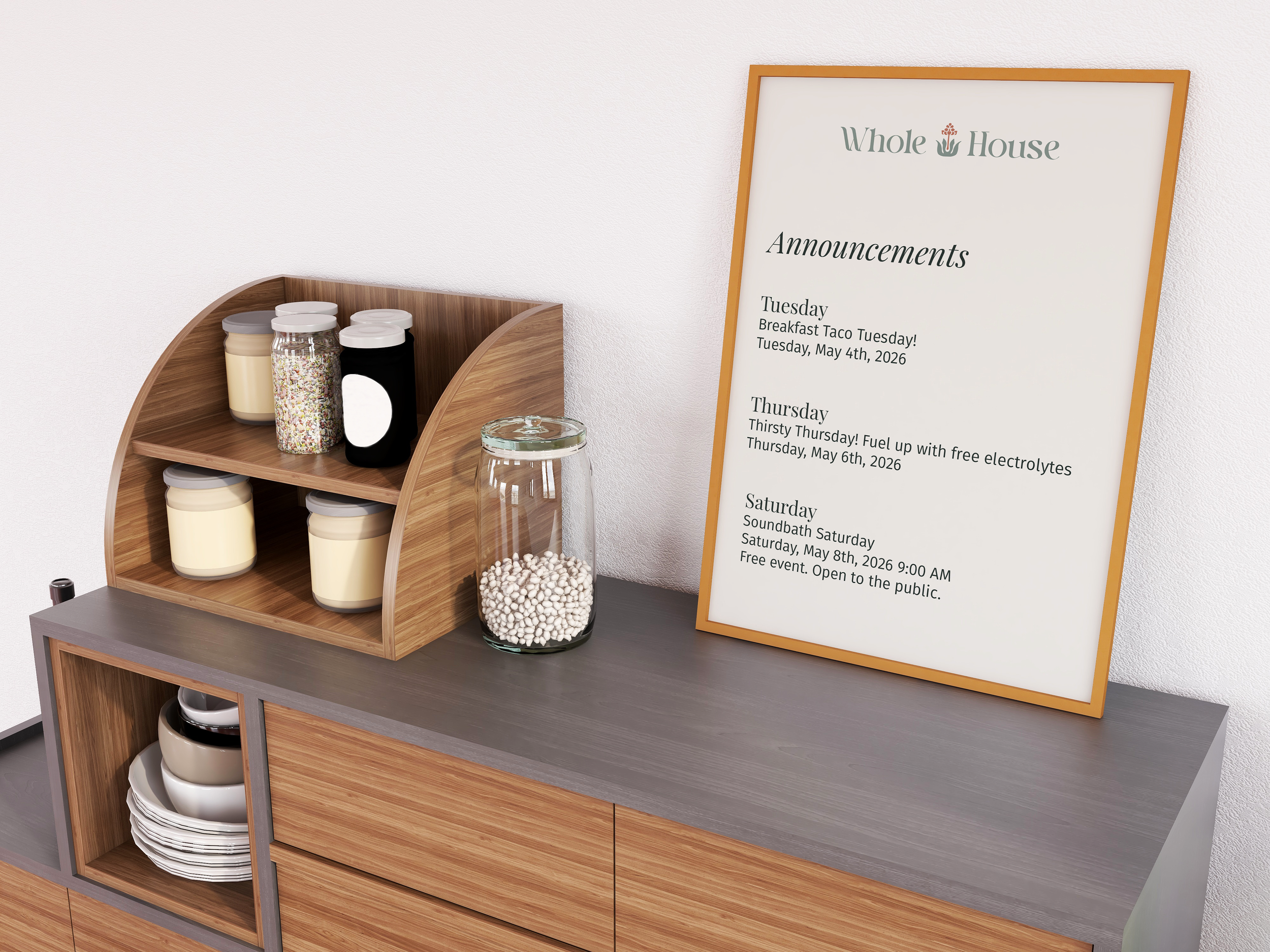
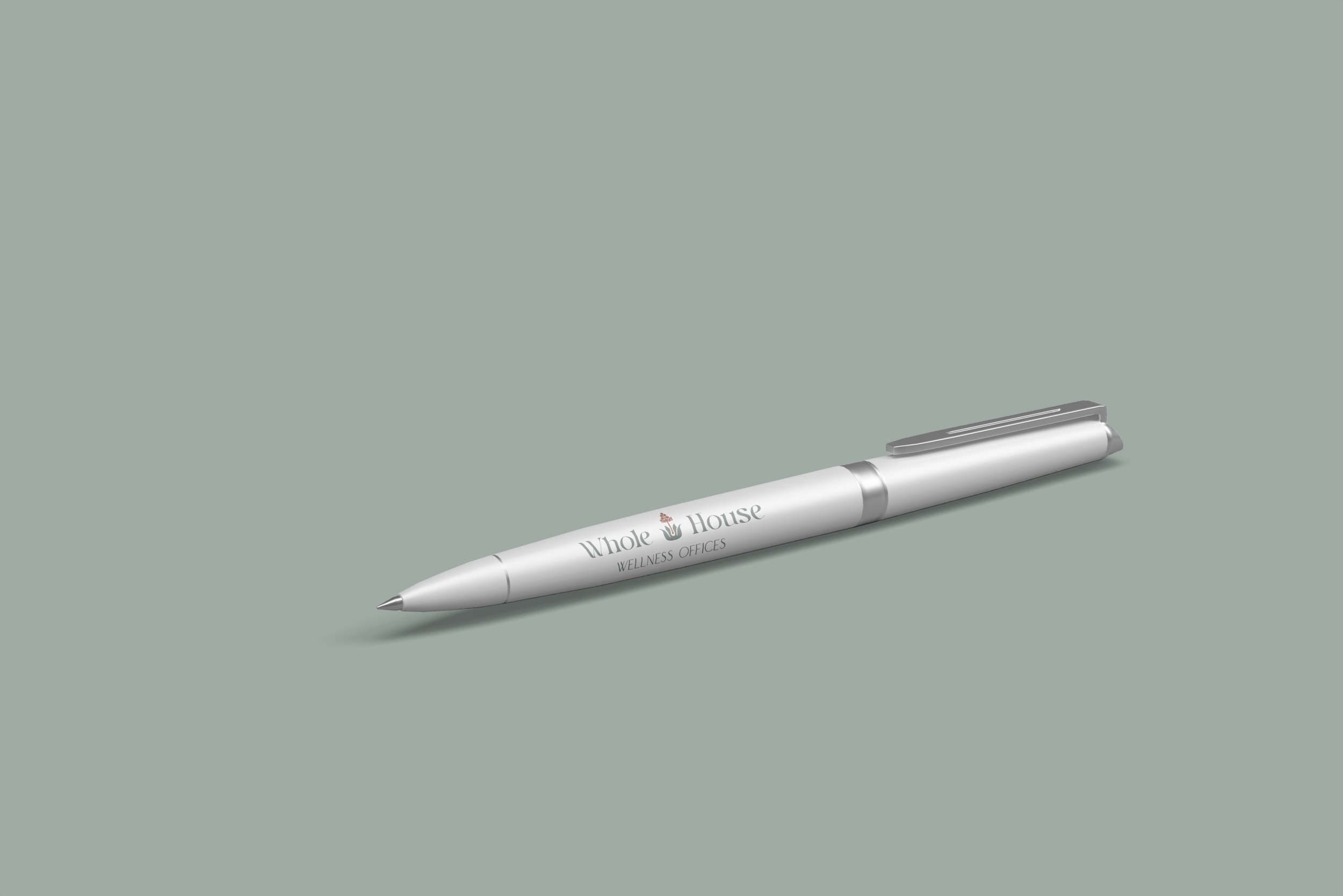
The color palette draws from natural, desaturated tones, creating a sense of visual calm while remaining flexible across applications. From there, the identity was extended across signage, printed materials, shared environments, and everyday objects within the space—ensuring a consistent and cohesive experience at every touchpoint.
Outcome
The final brand supports both the practitioner and their client. It communicates professionalism without intimidation and calm without ambiguity, creating an environment that feels considered, credible, and quietly supportive.
More importantly, it allows the space to begin doing its job before anyone even walks through the door.
Because in environments like this, design isn’t just visual—it’s functional. It shapes how people feel, how they show up, and how they connect with one another.
This project reinforced something I come back to often: strong branding isn’t about adding more—it’s about creating clarity.
When it’s done well, it gives people the confidence to fully step into their work.