Email Design
Contract work through Accordus · Email campaign design · Mercy Workshop, Detroit College Access Network
Summary
Nonprofits have important stories to tell and only a few seconds in an inbox to tell them. Since fall 2025, I've designed email campaigns for mission-driven organizations through Accordus, working within each client's established brand, copy, and photography alongside a Team Lead, Communications Coordinator, and writer. Here are two recent examples.
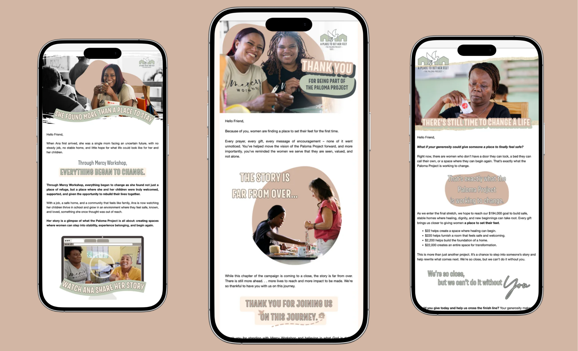
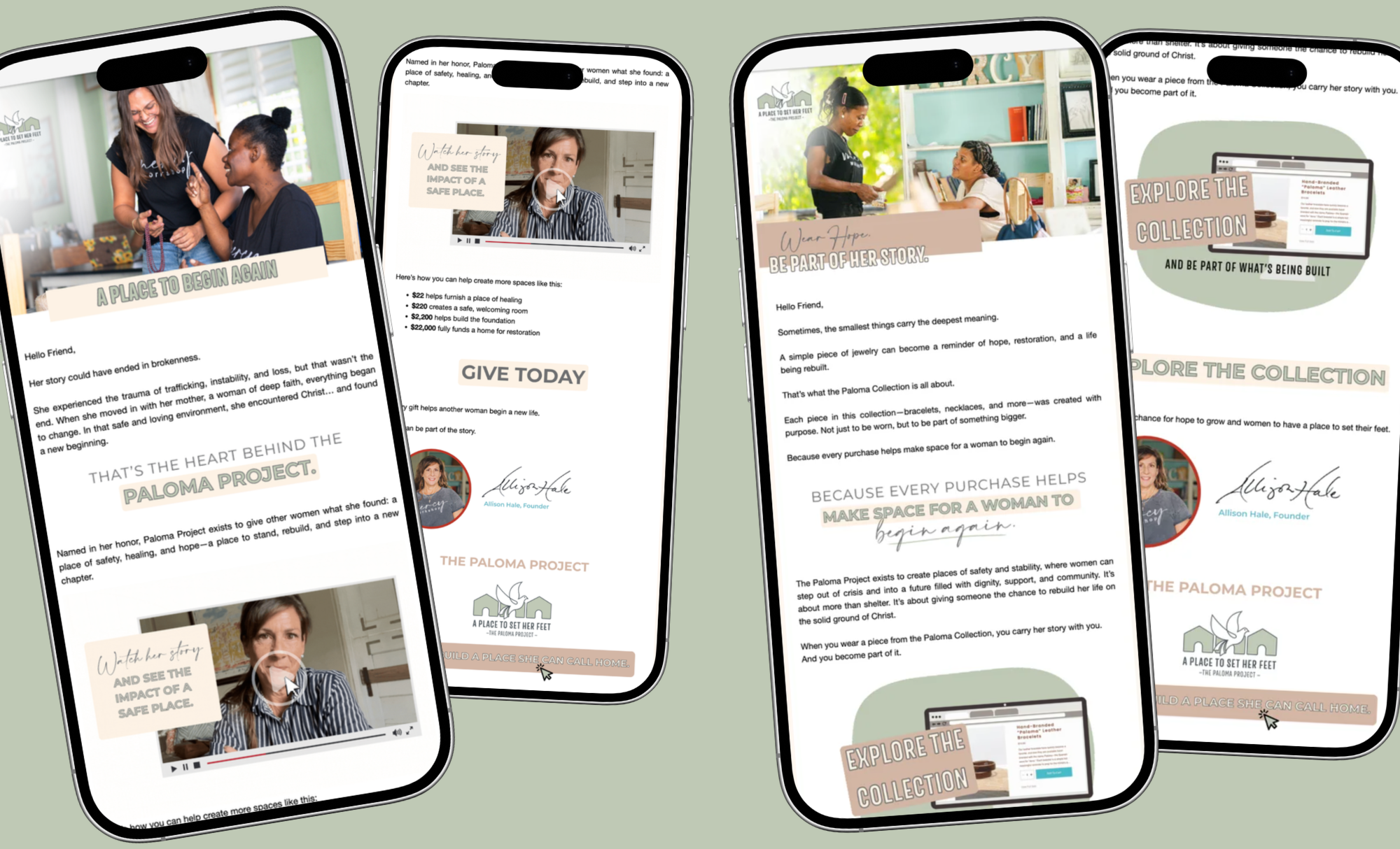
The Paloma Project | Mercy Workshop
Their goal: Mercy Workshop's Paloma Project is building a small community of homes for women rebuilding their lives after trafficking. This isn't a donation that disappears into a fund or a short mission trip that ends. It's a long, real path toward change, and Mercy Workshop needed its spring email campaign to help supporters feel that.
Their challenge: The brand identity, copy, and photography were already set. The emails had to carry more than information. They needed to convey the heart, hope, and joy visible in the photos of these women's faces.
How we got there: I built the email layouts within Mercy Workshop's established brand system, using text and graphic treatments to make each send feel dynamic and give the content room to breathe, so the photography and the story could lead.
The result: A campaign that feels like the mission itself: warm, hopeful, and human. Each email gives readers a small sense of what it feels like to watch someone rebuild.
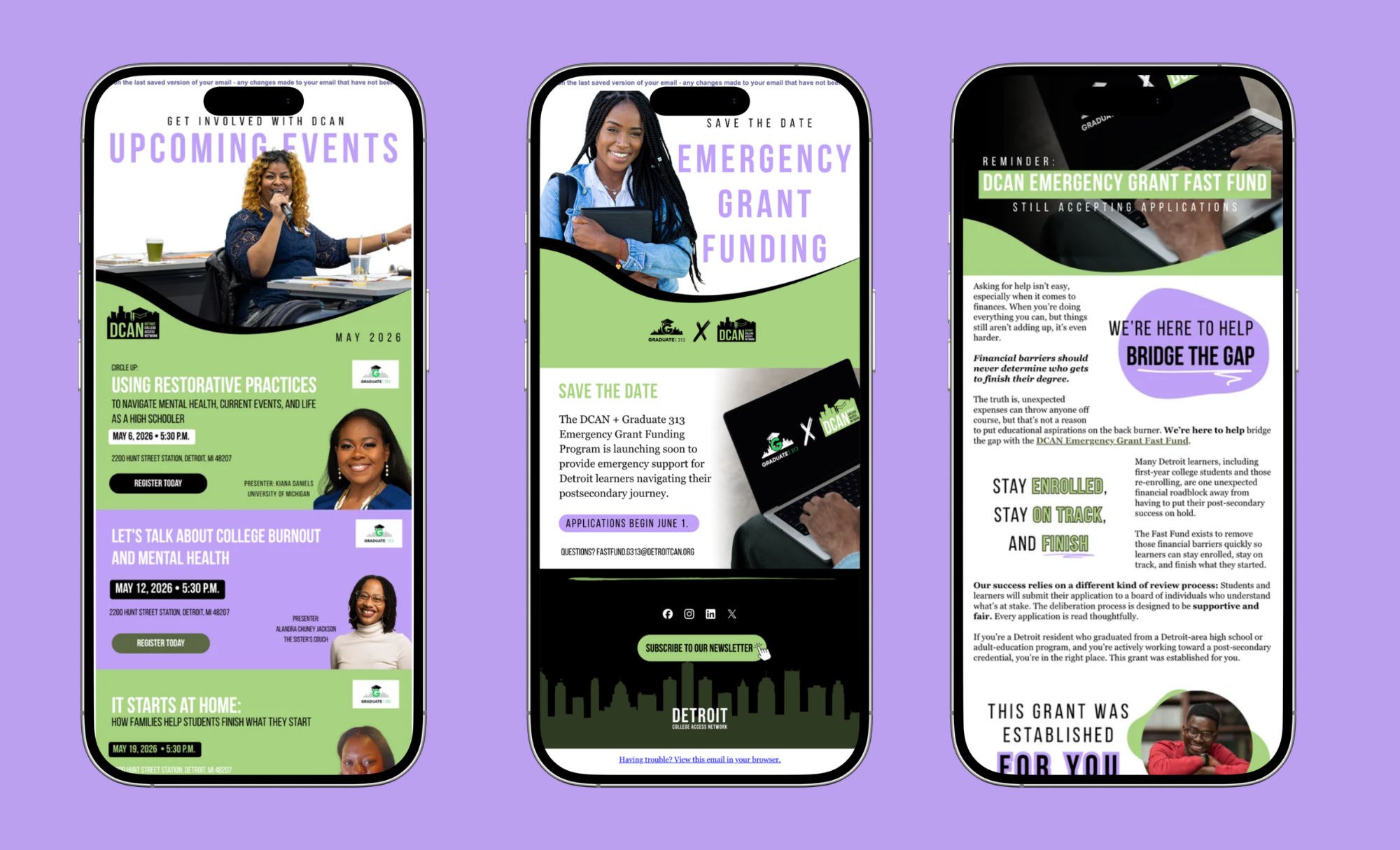
Detroit College Access Network (Detroit CAN)
Their goal: Detroit CAN works to make a college degree feel real and reachable for Detroit students. Their emails need to reach students, families, and supporters with information that can change a student's path.
Their challenge: Detroit CAN has a lot to say and good reasons to say it. Their content runs dense, and dense content in an inbox is easy to skim past.
How we got there: Working within their established brand and voice, I used text and graphic treatments to add energy and make the content easier to read without cutting any of its substance. My favorite part was creating movement through layout. A static photo, or a stat that feels flat on its own, can still pull someone in when the design around it is doing its job.
The result: Emails that keep all of Detroit CAN's substance but read with energy and momentum, guiding readers through the content instead of losing them in it.
Have a message that deserves more than a skim? Let's design emails your audience actually reads.