Kiosk Cafe
Self-initiated concept · Brand identity · Logo, color, packaging
Summary
Sarah and James wanted to turn a forgotten kiosk in San Diego into a neighborhood coffee hub. I helped them build a brand that carries the story of their travels and their globally sourced beans into a space small enough to fit on a street corner.
Their goal
Sarah and James had fallen in love with coffee on their travels, and with the way a good cup brings people together. When they came across a neglected kiosk in the heart of San Diego, they saw more than a coffee stand. They saw a place where neighbors could gather, friendships could form, and ideas could flow as freely as the coffee. Their menu would feature sustainably sourced beans from around the world, and they needed a brand that felt as warm and welcoming as the community they hoped to build.
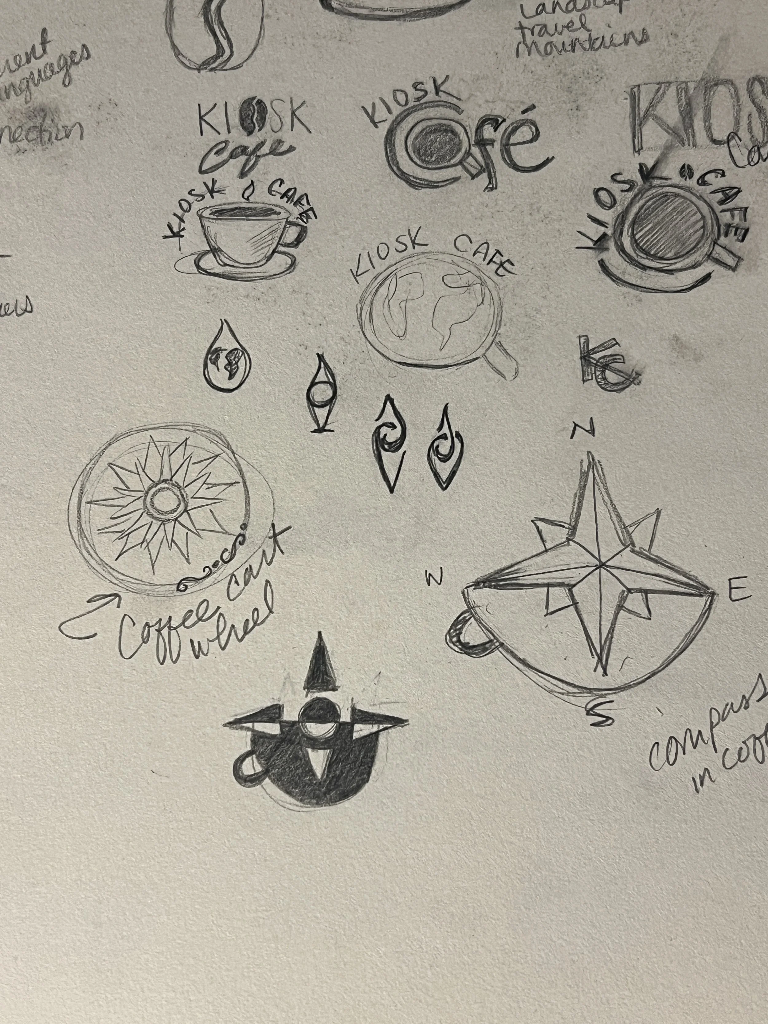
How we got there
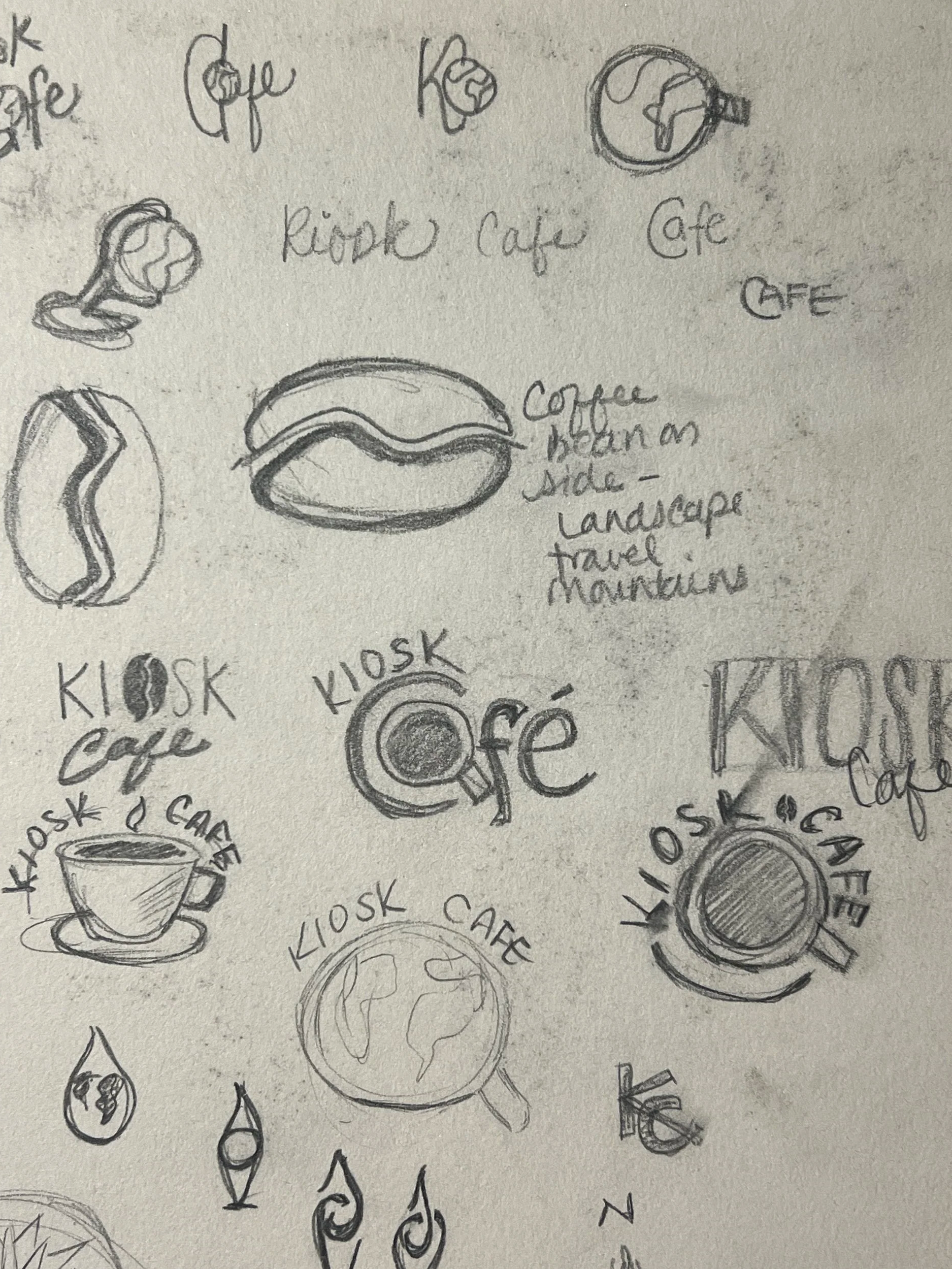
I understood their vision personally. Years ago, my husband and I visited a coffee farm in Costa Rica, and small cafés in San Miguel de Allende, Mexico, have since become our favorite places to slow down and connect. Communities are built over a cup of coffee, and that became the heart of the brand.
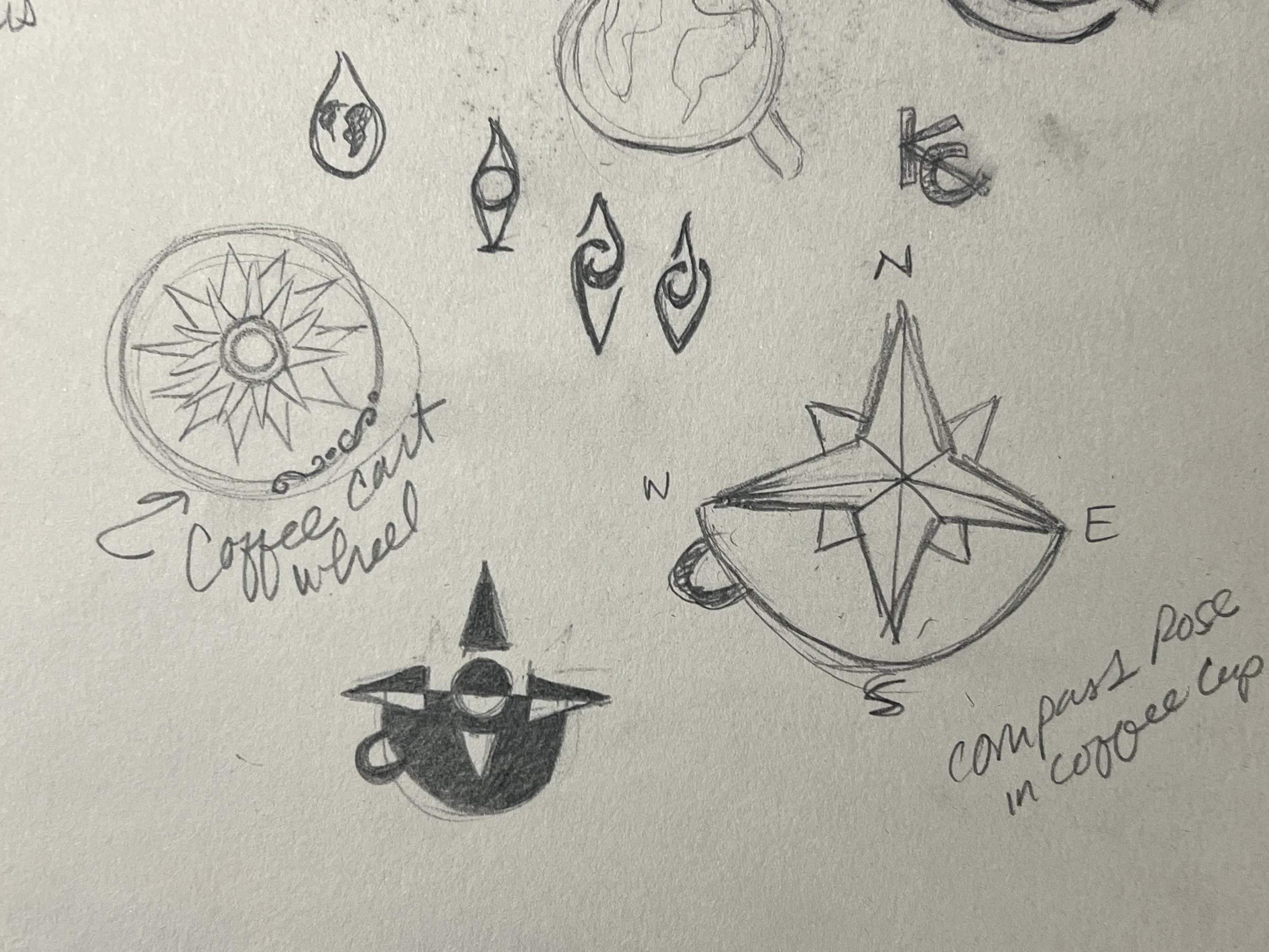
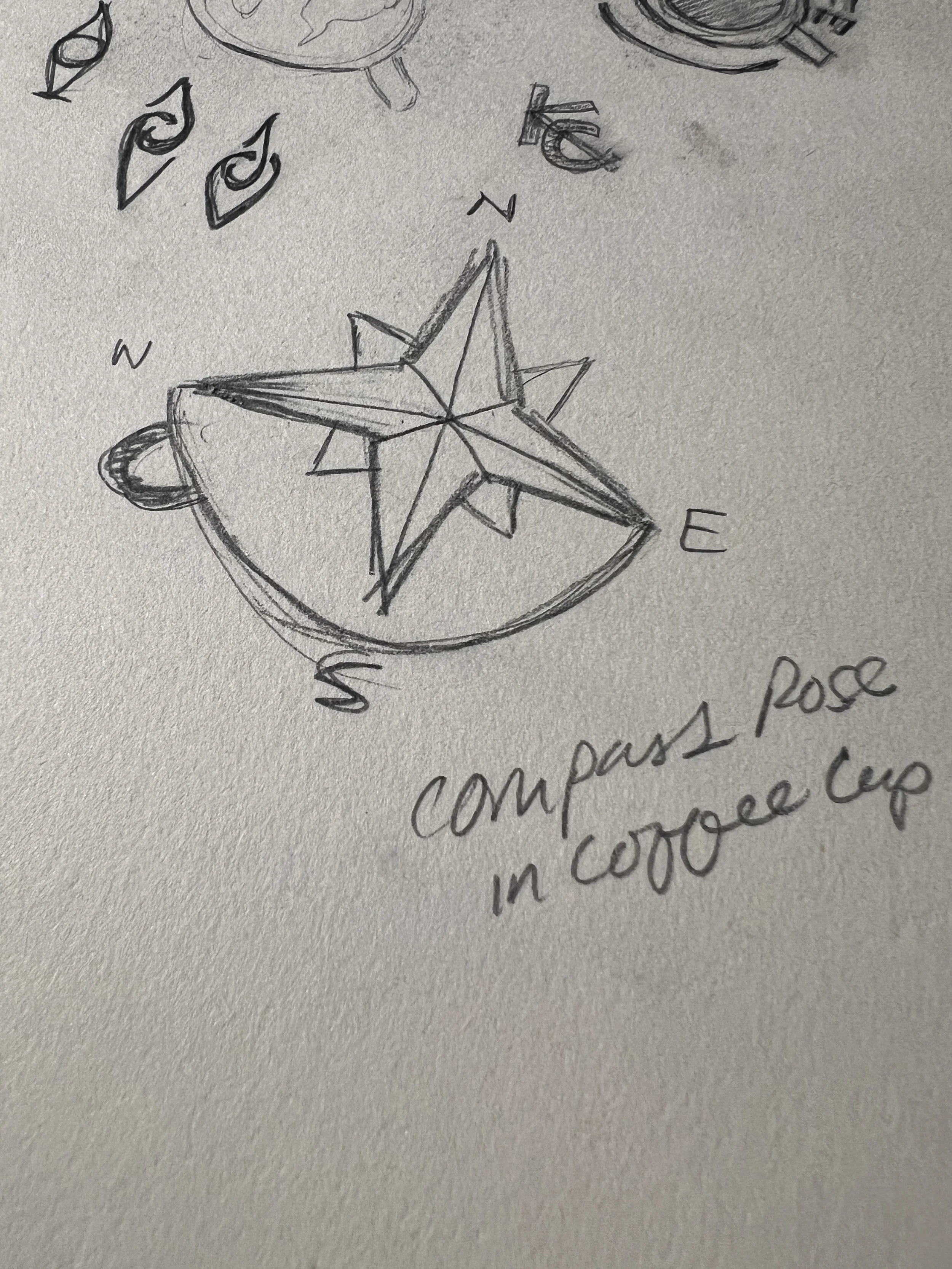
The mark: A compass rose paired with a coffee cup captures Sarah and James's journey, and their beans' journey, from around the world to a cup in a customer's hands. The compass rose also echoes the intricate painted designs on Costa Rica's traditional oxcarts (carretas), which once carried coffee across the country. Learn about the oxcart tradition.
Color: Grounded, warm, and vibrant tones reflect the cultures of the world's coffee regions. The primary orange was pulled from reference photos spanning Africa to Costa Rica.
Type: The logo is set in Brother 1816, a typeface that recalls the vintage stamps you'd see on old mail or "fragile" shipping boxes. That fits a brand built on beans that travel the world to reach the cup. It's also solid enough to carry the weight of the compass rose and coffee cup, so the name and the mark hold together as one strong unit.
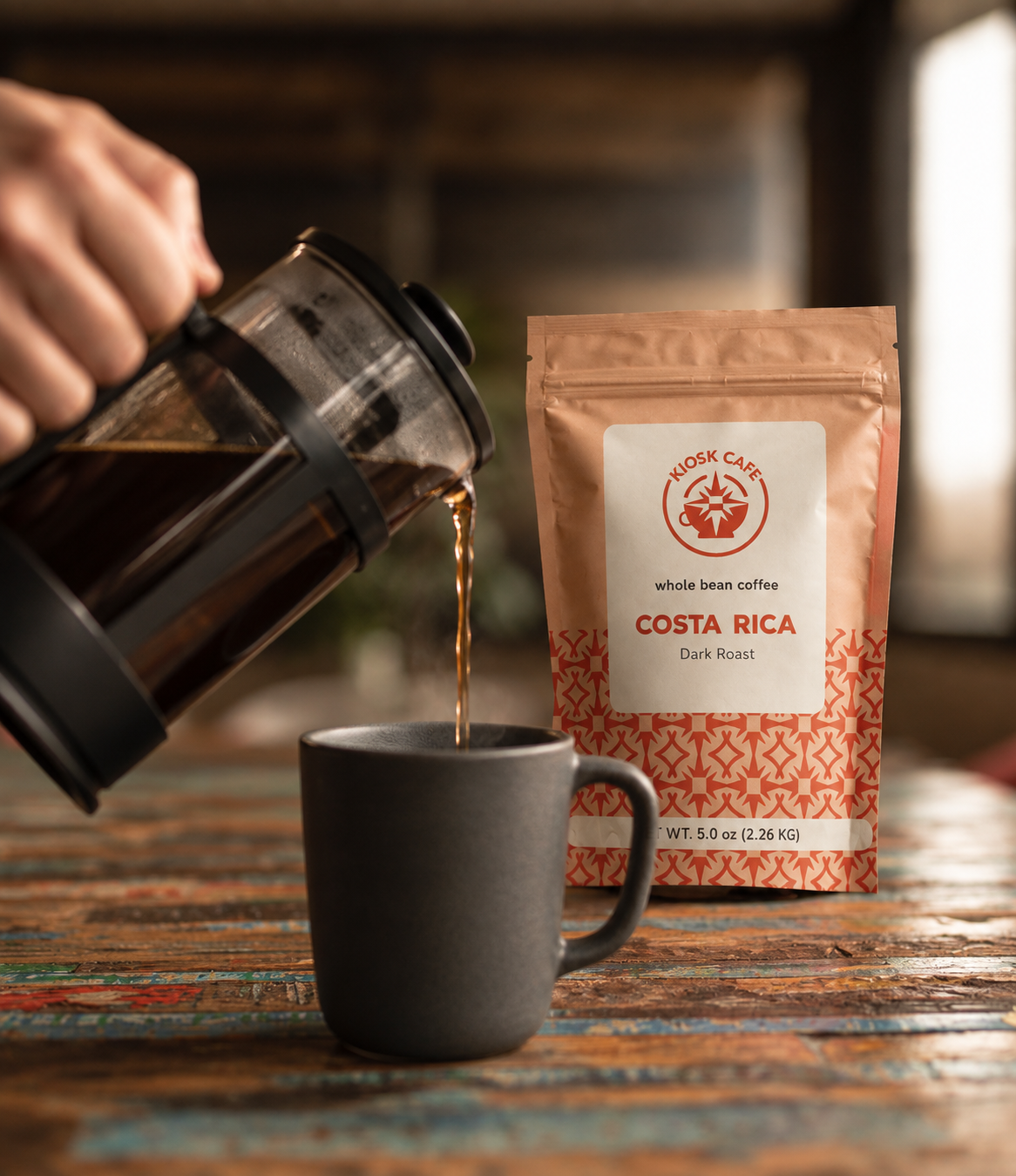
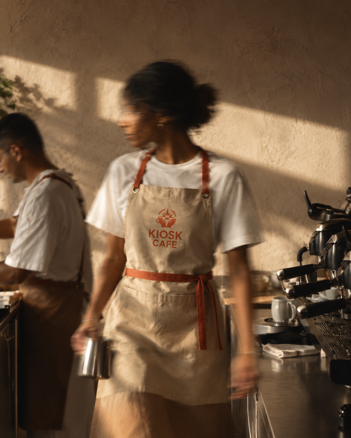
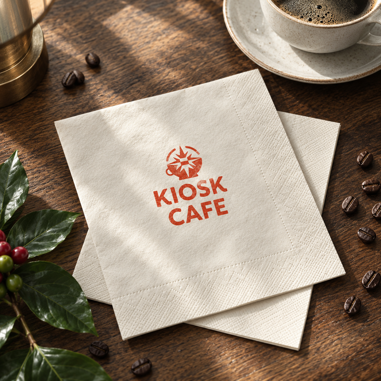
Deliverables: Logo, coffee bag packaging, sugar packet, napkins, employee aprons.

Their challenge
A kiosk leaves little room for storytelling. There's no dining room to decorate and no wall of photos from coffee farms. The brand itself had to carry their story of travel, origin, and community at a glance, on a cup, a bag, or a small sign.
The result
Kiosk Cafe now has a brand that feels as big as Sarah and James's story, even in a small space. The warm orange draws people in from across the street, and the compass-rose mark gives every cup a sense of place. It's a brand that invites neighbors to stop, stay a while, and come back tomorrow.
Dreaming of your own café, restaurant, or neighborhood spot? Let's build a brand that brings your people together.