Buns on the Run
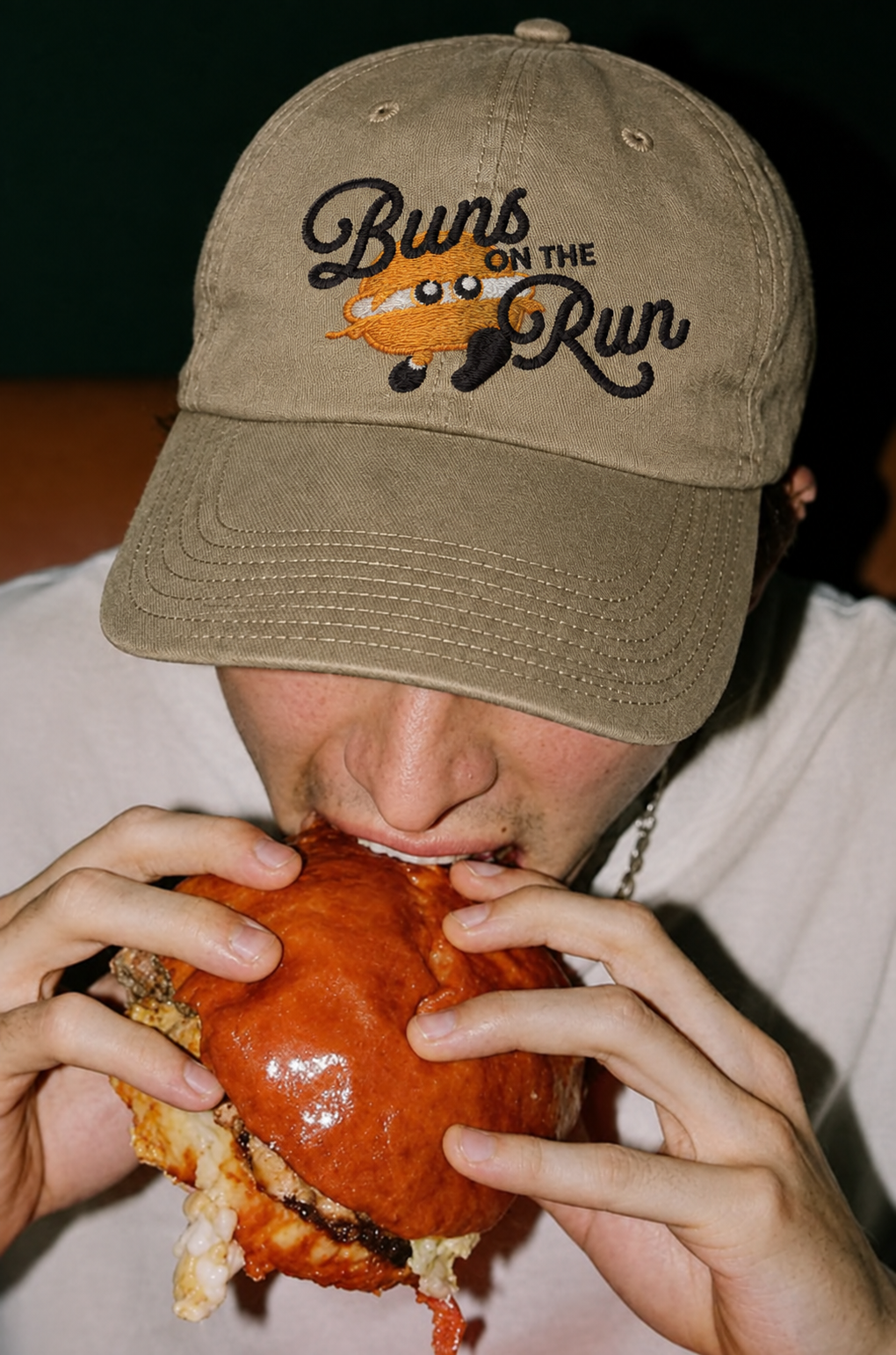
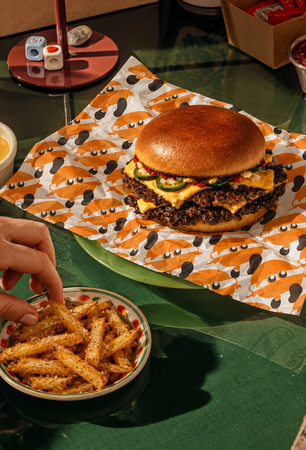
Buns on the Run came from a simple creative itch: what if a food truck could feel like homemade comfort, even when it's built entirely around convenience? That question became the whole direction. I wanted the brand to feel nostalgic without being dated, so I leaned into a color palette and photography curation that felt a little sun-bleached, a little familiar, then balanced that vintage nod with something playful: a minimalist cartoon mascot I got a little too attached to.
Look closely at the lettuce on top of his patty. It reads like a tiny cape. I didn't plan that. I just noticed it one day and couldn't unsee it, and that's the detail that made the whole brand click for me.
This concept started as a weekly brief from Brandbrief.io, but the direction and every decision after that was mine. It's a personal project, not client work, made just for the joy of making it. But it's one of my favorites, and honestly, I think that little guy deserves his own fan club.